Do you know the real problems of the state you live in? Are you looking at the hard data, or just listening to the media?
I live in Texas. If you relied exclusively on the news to determine which problems Texans should care about most, you wouldn't know that water scarcity is such a big problem. However, water scarcity for Texas receives a Problem Intensity score of 100, while the media coverage score is only 41.4.
Healthcare access tells a similar story: its Problem Intensity is 98.6, while media coverage scores only 39.4.
This difference between a problem's severity and how severely the media portrays it is what we call the Perception Gap. The purpose of the Perception Gap is to help voters distinguish between what receives attention and what is actually severe.
Polipad shows you the Perception Gap for multiple major problems, for all states.
1. Hidden Crisis or Inflated Narrative?
More specifically, the Perception Gap identifies two situations.
A Hidden Crisis is a problem that the data indicates is severe but receives comparatively little or mild media coverage. An Inflated Narrative is a problem receiving considerable negative attention even though the state's underlying conditions are not especially severe relative to the rest of the country.
This allows voters to compare media narratives with measurable conditions, and better understand what their state may actually need from its next senator.
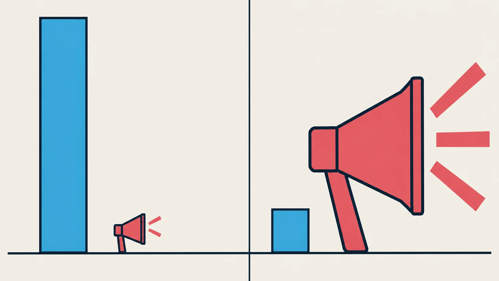 Hidden CrisisQuiet coverageInflated NarrativeLoud coverage
2. How are we calculating the Perception Gap?
First, we measure the actual severity of each problem using government statistics. This produces a Problem Intensity score from 0–100, with 50 representing approximately the national average and scores above 80 indicating particularly severe conditions.
Separately, we collect news articles about that same problem and determine how severely the coverage portrays it, producing a Sentiment Severity score on the same scale.
The Perception Gap is the difference between the two:
Perception Gap (Δ) = | Problem Intensity − Sentiment Severity |
The vertical bars represent the absolute value operation in mathematics. It simply measures the magnitude of the mismatch between reality (the problem) and feeling (the sentiment), regardless of the direction of the gap — that is, whether we are overreacting or underreacting.
A gap of eight points or less generally means the data and coverage are aligned. A gap above 20 represents a significant divergence, and may indicate either a Hidden Crisis or an Inflated Narrative.
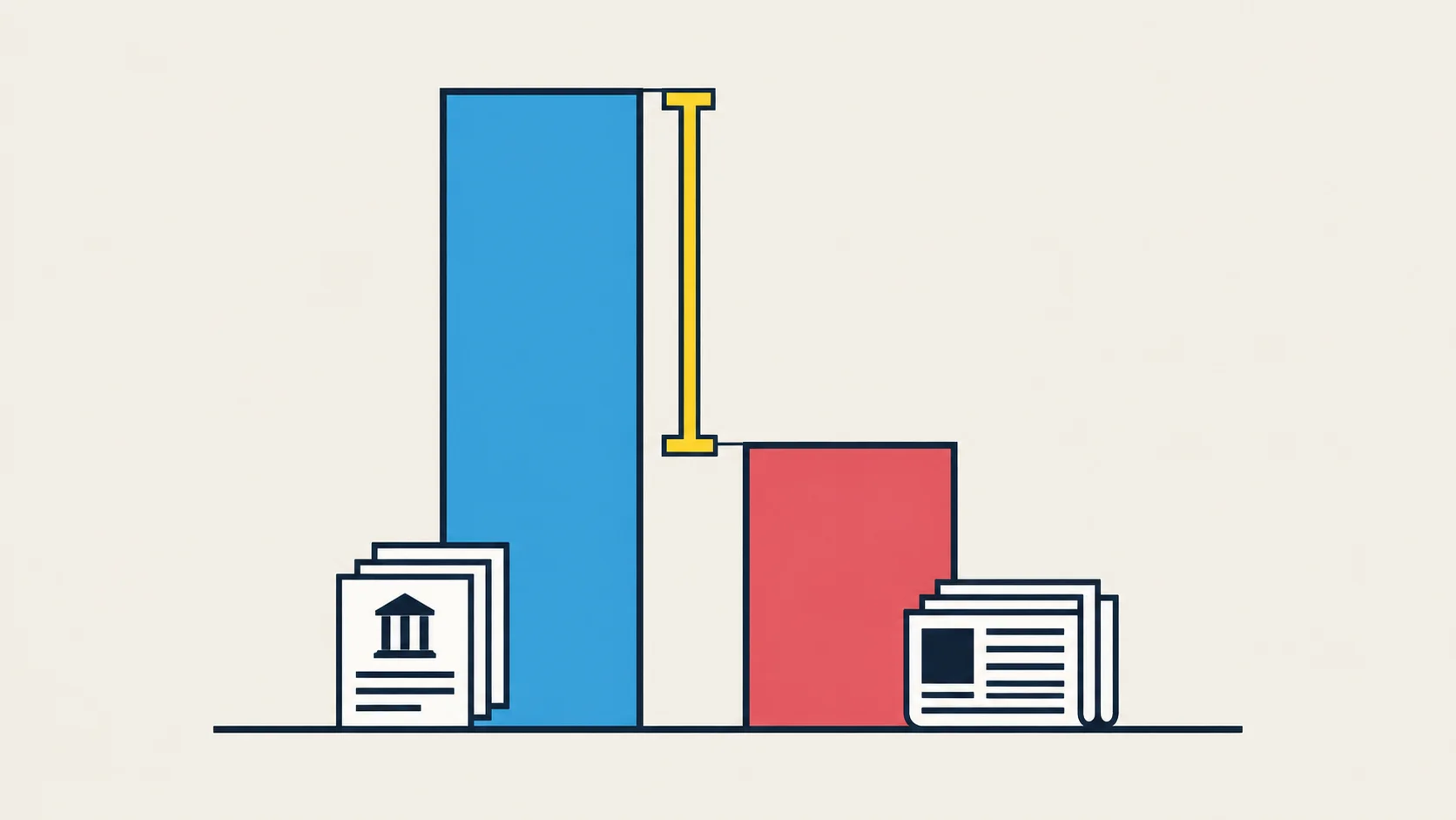 Problem Intensity 100Gap Δ 58.6Coverage 41.4
3. Where does the data come from?
For Problem Intensity, we rely on official government sources associated with each issue:
- Census Bureau — housing, food insecurity, education, and healthcare
- FRED and the Bureau of Labor Statistics — cost of living, wages, and employment
- FBI — crime
- EIA — energy costs and grid reliability
- EPA — water and pollution
- CDC — mental health and addiction
- NOAA — climate risk
- FCC — broadband
- FEC — corporate influence in politics
- GovTrack — political polarization
For the media side, up to 50 news articles are collected for each state and each problem. These articles are evaluated using Aspect-Based Sentiment Analysis (ABSA) to determine how severely the coverage portrays that specific issue. ABSA is an AI technique that breaks a text into individual topics to evaluate how strongly each is portrayed, rather than simply assigning a single overall positive or negative score to the whole piece.
4. What could critics say about the Perception Gap?
1. News coverage ≠ public opinion.
Correct. The Perception Gap measures the media narrative, not what voters say in polling. However, media coverage remains an important way voters learn about political problems, which is why we specifically describe the measurement as media sentiment rather than public opinion.
2. Too few articles could create an artificial gap.
Scores based on fewer than five articles are suppressed, scores based on five to seven receive a "Limited Coverage" warning, and a problem cannot receive the Hidden Crisis designation unless at least 15 articles support the media score.
3. News outlets are biased, potentially making sentiment scores unreliable.
To reduce this effect, coverage is collected across multiple outlets and outlet-bias ratings are mapped within the pipeline. Additionally, ideological differences may matter less when measuring practical problems, such as energy costs, that outlets across the political spectrum can report.
4. Problem Intensity measures relative rather than absolute severity.
This is intentional. A score of 50 represents approximately the national average, allowing us to identify which problems are especially severe within a state compared with the country as a whole.
5. AI can make mistakes when interpreting articles.
Absolutely. This is why scores are averaged across as many as 50 articles, the same model is used consistently, and article counts remain visible for readers.
5. Where are the largest Perception Gaps?
Among results supported by at least 15 articles, the ten largest current Perception Gaps (as of 1 September 2026) are:
| # | State | Problem | Reality | Coverage | Gap Δ | Type |
|---|---|---|---|---|---|---|
| 1 | Georgia | Water Scarcity | 100.0 | 3.3 | 96.7 | Hidden Crisis |
| 2 | Alaska | Crime & Safety | 98.4 | 7.2 | 91.2 | Hidden Crisis |
| 3 | Connecticut | Energy Costs | 78.5 | 0.0 | 78.5 | Hidden Crisis |
| 4 | Oklahoma | Grid Reliability | 89.2 | 22.4 | 66.8 | Hidden Crisis |
| 5 | Mississippi | Education Quality | 76.3 | 12.5 | 63.8 | Hidden Crisis |
| 6 | Montana | Corporate Influence in Politics | 100.0 | 36.8 | 63.2 | Hidden Crisis |
| 7 | Michigan | Political Polarization | 16.8 | 78.8 | 62.0 | Inflated Narrative |
| 8 | Arizona | Political Polarization | 20.3 | 80.8 | 60.5 | Inflated Narrative |
| 9 | Texas | Healthcare Access | 98.6 | 39.4 | 59.2 | Hidden Crisis |
| 10 | Texas | Water Scarcity | 100.0 | 41.4 | 58.6 | Hidden Crisis |
A Problem Intensity score of 100 represents the top of the severity scale. Eight of these ten gaps are Hidden Crises. The two exceptions are both political polarization — in Michigan and Arizona — where media coverage portrays the problem as substantially worse than the underlying data suggests.
This table is a snapshot, taken 1 September 2026. Problem Intensity moves only when a government source publishes new data, but Media Focus is refreshed every month — so the ranking shifts. For the current standings, see the live version: Biggest Perception Gaps, which is recalculated every time you open it and links through to each state's full ledger.
6. What do the top five gaps mean for voters?
1. Georgia — Water Scarcity (Δ 96.7)
Georgia receives the maximum Problem Intensity score while media coverage is close to silent on it. Water scarcity directly affects agriculture, household water costs, and the continued growth of metropolitan Atlanta — and Georgia has spent decades in interstate disputes over river water without that showing up as a running news story.
2. Alaska — Crime & Safety (Δ 91.2)
FBI data places Alaska first among the 50 states for violent crime, while media coverage of it is minimal. Distance is part of the story: in a state where many communities are off the road system, response times and the availability of law enforcement are practical daily questions rather than abstract ones, and they rarely surface in coverage.
3. Connecticut — Energy Costs (Δ 78.5)
Connecticut has some of the highest electricity costs in the country according to EIA data, while its media Sentiment Severity score is zero. Voters may therefore experience the problem on their utility bills every month without it being treated as a major political issue. Note that this score rests on 17 articles — just above our minimum — so it is the least heavily evidenced entry in this list.
4. Oklahoma — Grid Reliability (Δ 66.8)
EIA outage data places Oklahoma high on the severity scale while coverage stays modest. The state sits where ice storms and tornado season meet long rural distribution lines, so a prolonged outage is a heating-and-cooling problem before it is a convenience problem.
5. Mississippi — Education Quality (Δ 63.8)
Our education measure is the share of adults without a bachelor's degree, and Mississippi sits high on that scale while coverage barely registers it. That matters less as a verdict on any particular school than as a constraint on the state's economy: the mix of employers a state can attract, and the wages they pay, follows from the workforce available to them.